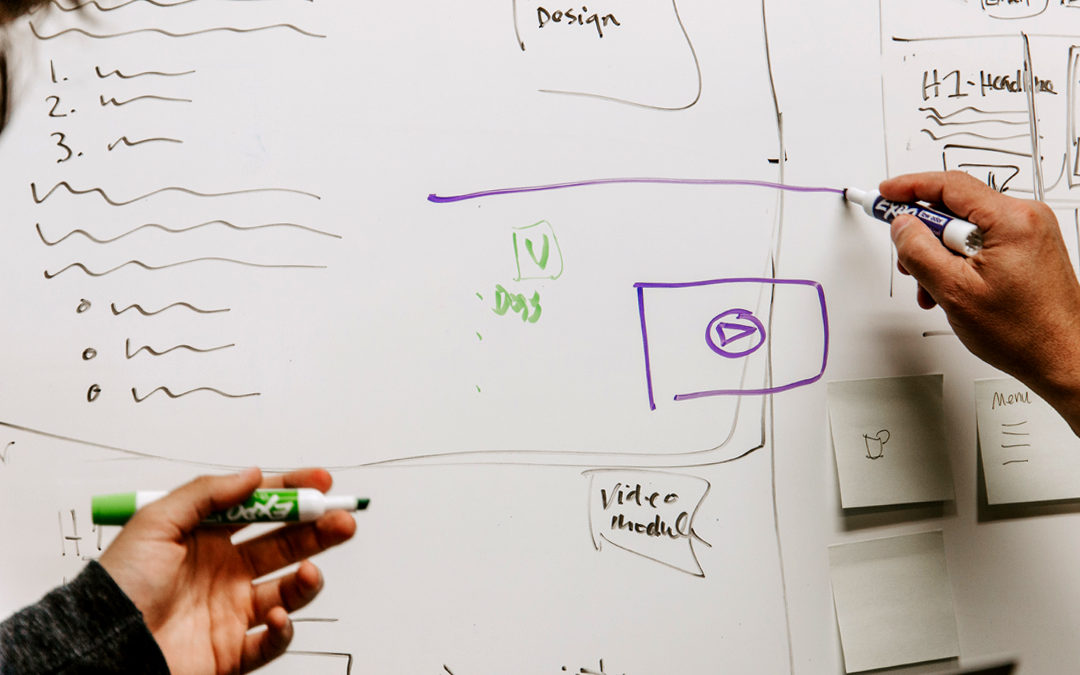
Creating a new website is an exciting process. It’s a lot of fun, but a lot of work too. It’s easy for both the client and designer to just jump right in and start with the fun stuff – I’ve been guilty of this a time or two – but there are some basic things that need to done at the beginning of the process to help things run smoothly.
This list isn’t comprehensive by any means, but it consists of a few common themes I’ve run into over the years. Take the time up front to check these three things off your to-do list, and you’ll be off to a great start.
Three tips as you prepare for your new website:
TIP 1. Make sure you track down the highest resolution version of your logo possible.
A vector file is always best (like a .ai or .eps), but at minimum, you need to track down a high resolution raster image, like a JPEG or PNG.
If you don’t have a vector version of your logo on hand, you may have to track it down from whoever created your logo, maybe a graphic designer you’ve worked with in the past, or sometimes a printer you’ve used for business cards or stationery will have a copy of it.
Failing to provide a quality version of your logo will either put serious limitations on the creativity of how your logo is displayed, result in a blurry or pixelated logo image; or your designer/developer is going to have to spend time recreating the logo, which likely will cost you more money.
Terms Used:
Vector File: This is a type of file that designers use because it can be scaled to any size without distortion. Vector graphics are comprised of paths and curves that make up the boundaries of the image
Raster Image (rasterized image): This type of file consists of tiny squares, called pixels, to make the image. These images can typically be scaled down without noticeable distortion, but they begin to lose quality as soon as you enlarge even one percent.

Bonus: The nice folks over a Shutterstock have a great blog that will help you understand Raster vs. Vector: What’s the Difference and When to Use Which.
TIP 2: This tip probably seems really obvious, but have your text ready for the designer.
It’s easy to jump right into the fun stuff, like picking out pictures, graphics or mocking up the layout of the site, but things will move quicker and smoother if you have the text ready at the start of the design process – even if it’s just a rough draft. If you are really struggling to create all of the text for the site, at minimum, give your designer some bullet points for the places where you’re stuck.
While it is possible to use dummy/placeholder text (a.k.a. lorem ipsum) to plug in where actual text will go later, it’s better to take the guess work out of the equation. Your designer doesn’t know if the section they’re building might have two sentences or 20.
Nerd alert: What is lorem ipsum is and did it originate?
TIP 3: Establish a Call to Action.
Take some time to plan out the call to action for your site. The purpose of your site might be to inform visitors, but what action do you want them to take? Are you trying to sell something directly on your site? Do you want visitors to call you, visit your physical location, or maybe connect with you on social media? Letting your designer know what the primary call to action will help them put the right elements and features in place to drive or funnel visitors to that action.
As with most things in life, put in a little bit hard work at the beginning of your website project and the fun stuff will fall into place easier when it’s time. This will ultimately give you more time to spend on the fun stuff like picking out pictures, graphics and/or video to use.
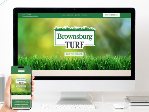
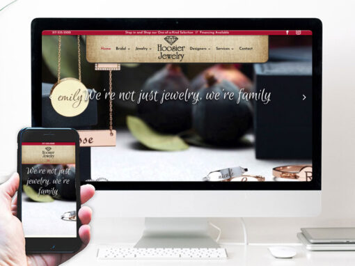
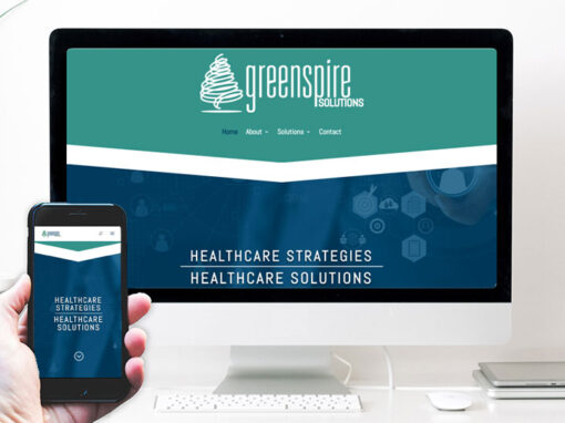
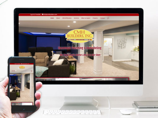
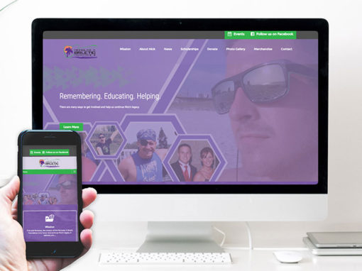
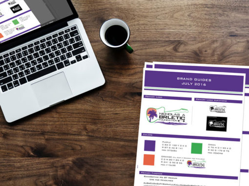
EXAMPLES OF OUR WORK
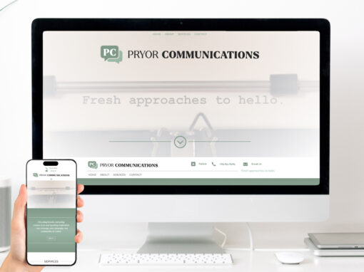
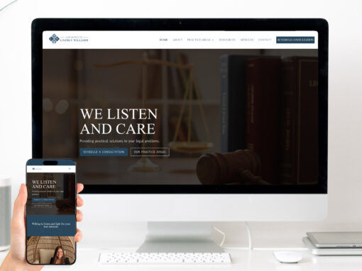
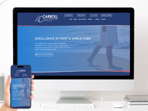
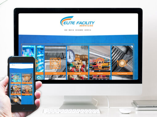


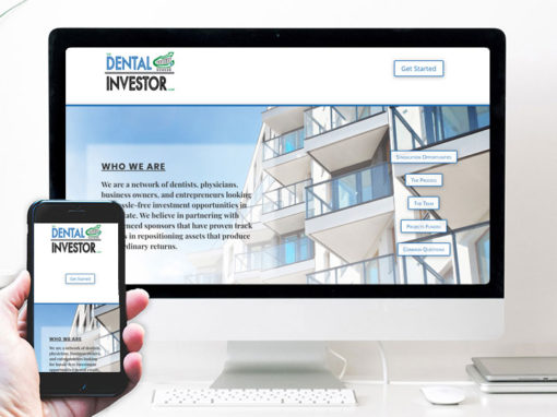
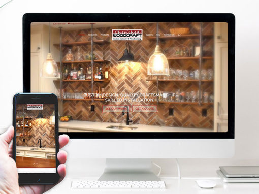
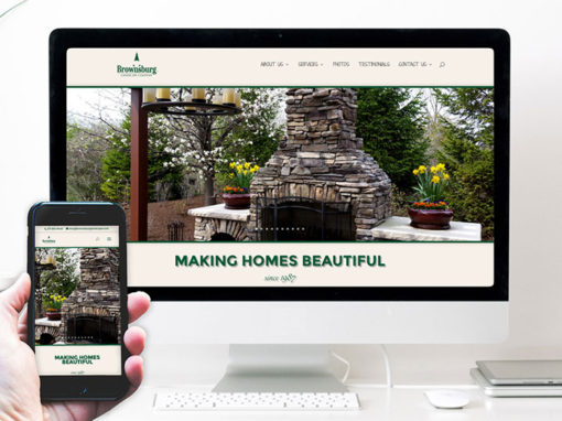
We’d love the opportunity to share a conversation with you about your goals online. Fill in the form below and we’ll be in touch!
