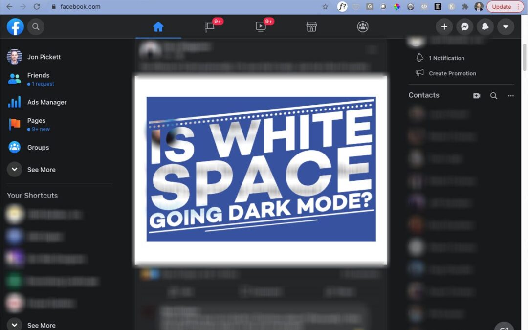
It appears “dark mode” is becoming less of a trend and more of a mainstay. Facebook recently rolled out this feature on its desktop version and even more recently, mobile.
 There are several advantages to dark mode (not “dark side”), although some are still up for debate. Many say that the darker screen is less straining on the eyes (less blue light) and it’s been proven that the darker screen extends your device’s battery cycle because it doesn’t require as much power to display the darker background.
Other apps and software like Outlook, Netflix, Instagram, and Twitter have already made the switch to dark mode or at least made it an option. As this trend develops, I wonder how this might influence digital design overall.
Ask any graphic designer if they “would like more white space in the design?” and they’ll likely chuckle while rolling their eyes. The story behind the chuckle and eye roll is that designers are constantly advising (or even battling with) clients that white space provides room for the eye to rest and actually adds to the other elements of the design. While white space doesn’t haven’t to be white, traditionally it has been a lighter color. But are we in the midst of a shift completely to dark space as the new white space – at least online?
I imagine that technology manufacturers will catch up to the consumer and the default will be screens that don’t use blue light and/or use a display that doesn’t drain your battery when display white or light colors. When it does catch up, it will be interesting to see if backgrounds revert to white or lighter colors, do we keep the dark mode, or does it become a matter of user preference?
One thing that is for sure is that design is forever evolving and driven by the consumer. I predict you will see a lot more websites switching to a permanent dark mode design or at least providing that option to users.
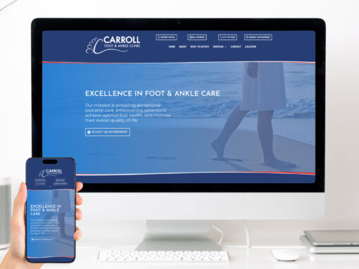
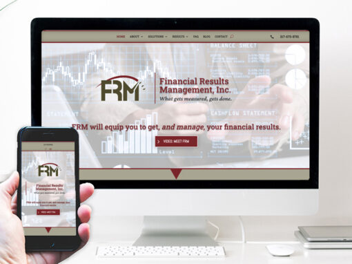
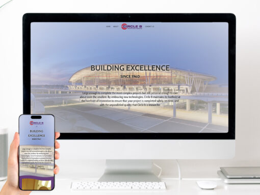
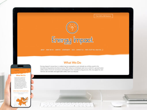
EXAMPLES OF OUR WORK








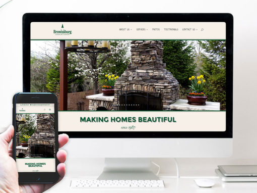

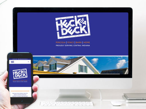

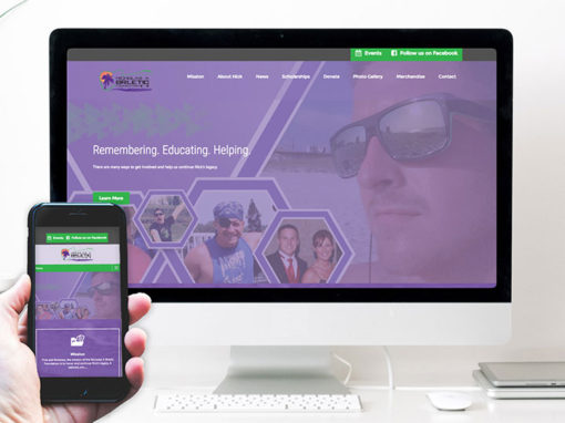
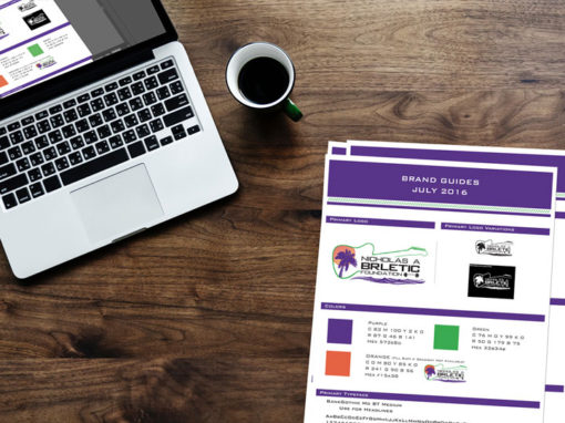
We’d love the opportunity to share a conversation with you about your goals online. Fill in the form below and we’ll be in touch!
